By themselves, fonts have a lot of personality. From the classic look of Times New Roman to the modern appearance of Helvetica Condensed, you have a lot of options for turning words into visual expressions.
But you can extend these expressions beyond the visual character built into each font. One easy way to do this is by applying brushes to fonts.

Affinity Designer has the tools to apply colors and brushes to type. In this article, we’ll only use vector brushes. Raster brushes are another approach in Designer, but vector brushes give you the freedom to resize your artwork without impacting its resolution.
Getting Started
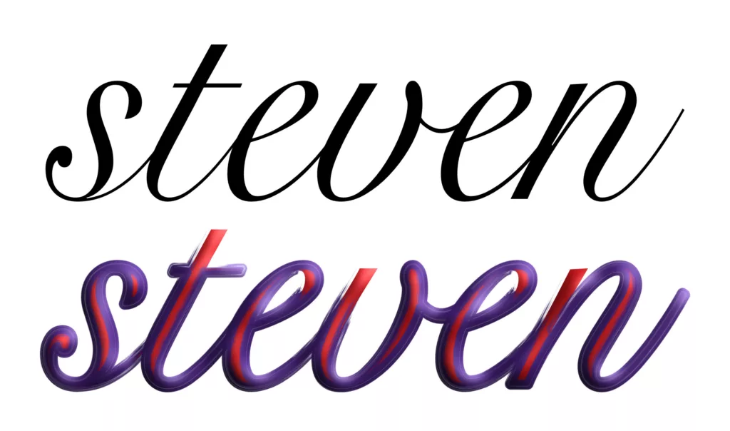
To start, type a word you’d like to brush. I typed my name using the Artistic Text tool and chose Academy Engraved LET for its font.
Changing Fill and Stroke Colors
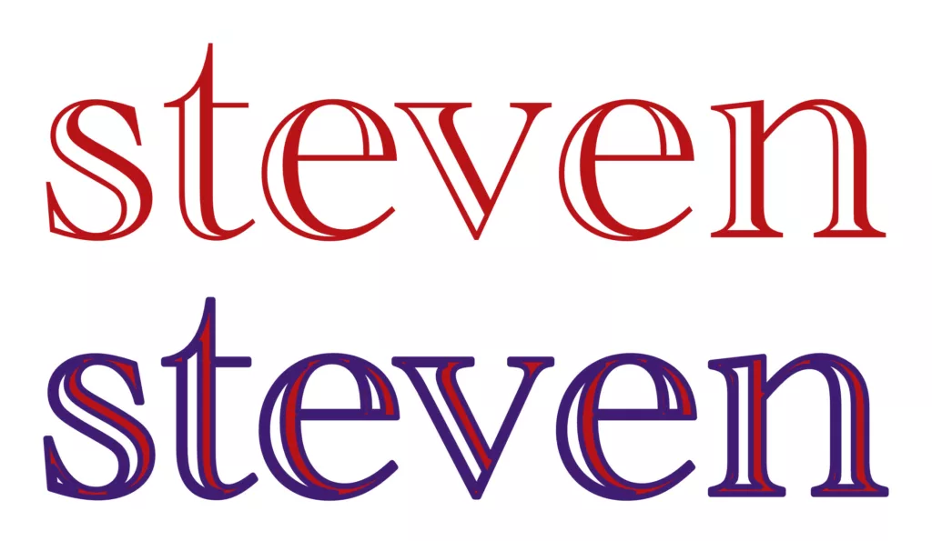
Begin by selecting the word and then in the Color panel change the default black fill to red. While in the Color panel apply a dark blue to the stroke. Note that this particular font looks like it comprises only a stroke. Designer treats it as having a fill, thought the result looks like two colored strokes. (See below for a more regular font that has a solid fill.)
Adding a Brush
Now it’s time to brush the word. First, select Vector Brush tool. Next, click to open the Brushes panel. Navigate to the Oils category and choose Fine Oil 01. By default, the brush is designed with a particular stroke width. While that width may be appropriate for your design, you can fine tune the width by opening the Stroke panel. I chose 12pt for stroke width for my design.

Using a 3D Effect
To further customize the visual effect, I opened the Layer FX panel and clicked on 3D.
From the 3D settings, I set Soften to 32px, Depth to 200px and Radius to 200px.
Variations
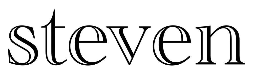
The font I chose is unusual. Its letter characters appear to be outlined as if it were drawn with an engraving tool. You can choose a more usual font with a solid fill. Here’s a version that employs the same customizations as above.